October 2013
Brand, UX, visual
Mint Digital
Pin Radio is a neat and tidy, browser based
music player, created in four days under a brief from Universal
Music’s product innovation team. The product innovation team at
Universal and responsible for finding ways of making the most
of Universal’s extensive catalogue with new digital
products.
One idea they had been playing with was in the retail space -
how retailers could bring something of the in store experience
online, through music. They came to Mint with a rough idea for
their ‘retail radio’, looking to create a music player targeted
at large eCommerce websites, which could be loaded with custom
playlists to enhance their customers shopping experience.
They tasked Mint with producing a working demo of this, which
they could present back to their team internally with a view to
taking it to retailers, and developing the product further in
the future.
One of Mint’s techniques for quickly building, launching, and testing ideas is to offer clients a ‘Four Days To Launch’ - four focused days of work with a small team working together to make an idea real and demoable. This approach tends to work best when the scope of the product is fairly well defined with a clear end goal, so in the case of Pin Radio it was an ideal solution, and we were able to hit the ground running on the morning of the first day.
I led design for the product in a team
which comprised of a front-end developer, and back-end
developer, and one other designer offering support when needed.
Three people from the client side also joined us - we always
try and involve the client as much as possible in the four
days, and at least in the early stages everyone in the room is
a designer.
Day One
Start UX. Start Coding.
Day Two
Code. Visual design.
Day Three
Code. Apply visual design.
Day Four
Finish coding. QA. Launch.
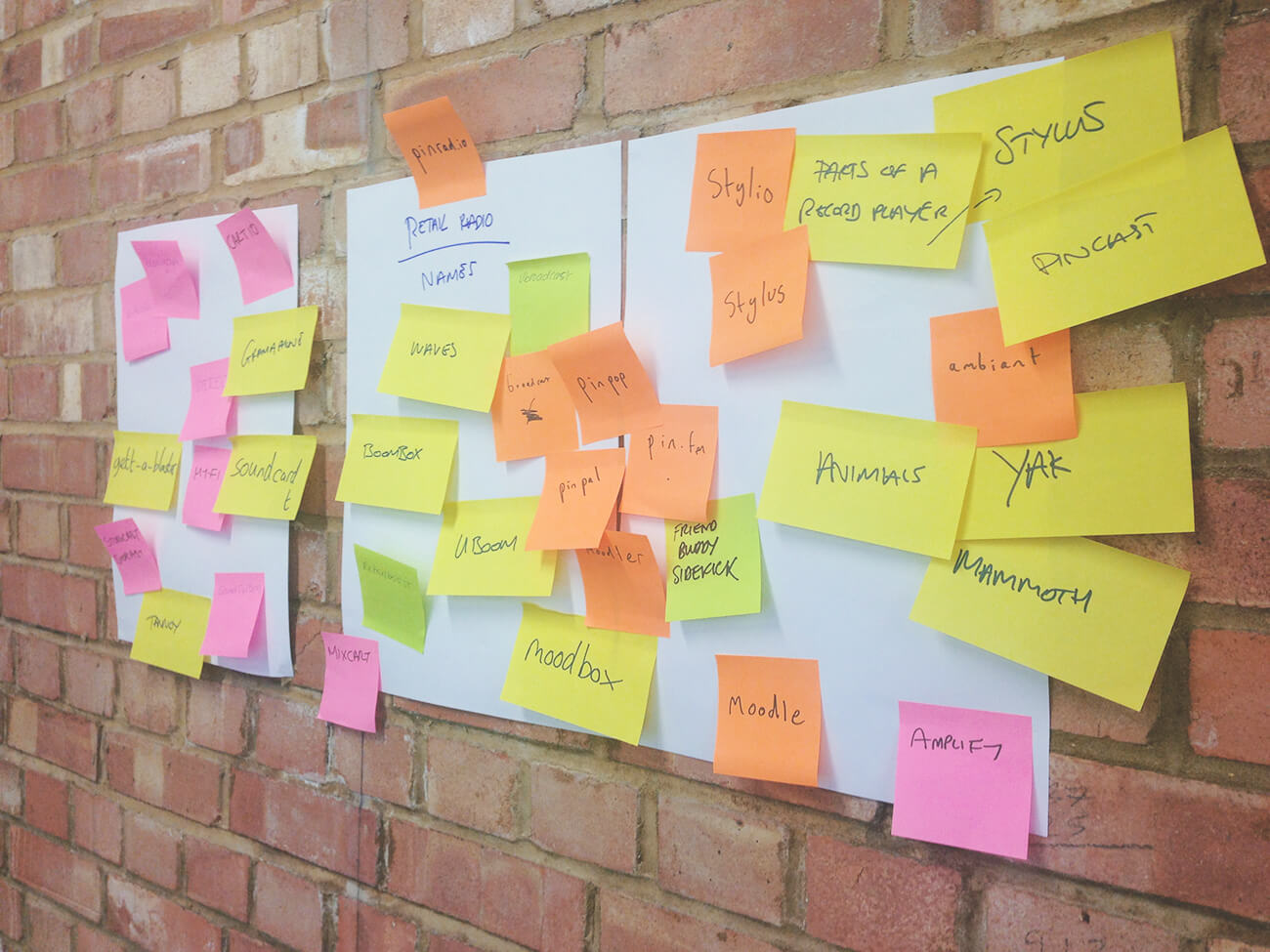
On the first morning we set about naming
and branding the player. Usually it makes sense to not get hung
up on names too soon, but given the short timeline we were
working too, I felt that it would help kick things off in the
right direction and give us momentum.
We chucked a bunch of names up on the wall and landed on Pin
Radio, a name I suggested. Pin Radio had a lightness to it
which captured the size of the player, and also the fact that
the player would ‘pin’ to the browser window.
We drew up a list of basic functionality
the player needed after generating some simple user stories,
both from a consumer and admin’s point of view. Essentially a
consumer needed to play, pause, and skip tracks, select
playlists, and control volume. The admin of the site needed
control over creating playlists and the appearance of the
player. Given these requirements, our developers were able to
start building a simple CMS which handled playlists and would
later provide options for the colour of the player so it would
be able to tie in with a brand’s website.
The rest of us started to sketch solutions and different
approaches to the UI. Most of us have used either Spotify,
iTunes or something similar for years, and have a fairly well
formed idea of how a music player should look and feel. The
challenge was how to keep the player’s controls accessible,
whilst not intruding on their experience of the rest of the
website. I looked at different solutions for this - having the
player in bottom, top, left, and right of the browser, and
thinking about reduced and expanded views of content.
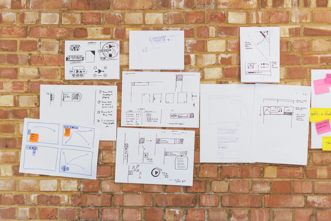
After pushing the music player in different
directions, we arrived at something which would have two views
- firstly a miniaturised view with only basic controls
available (play/pause and skip), then an expanded version with
track details, and playlists on another panel.
The first view would appear as a small tab at the side of the
screen, sliding out like a tray when expanded. Though I had
liked the idea of it a triangle in the corner of the screen, or
a long thin bar at the bottom, a tab on the left began to feel
like the most accessible, and flexible solution.
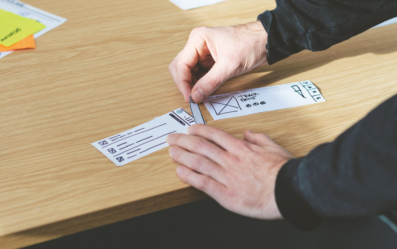
We made a rough paper prototype (below) to demo how the player
would feel on top of a website. I like being able to test ideas
quickly like this and quickly iterate on the details. It also
enabled our front end developer to start laying in place a
foundation at the end of the first day, before any visual
design had taken place.Having something clickable in the
browser as quickly as possible was our aim, so we could test
the product within our group and make adjustments to
interactions there.
I quickly translated the paper prototype to a basic wireframe to get a better sense of proportions which would provide a little more guidance as front end work progressed. I was keen to move to visual design at this point to refine the details of the UI. The volume control still needed resolving, and the pin icon which would open and close the player would also need some thought too.
I provided the client with a UI moodboard
which leaned towards the minimal. We had sketched solutions
which borrowed metaphors from record players of ghetto
blasters, but given that I felt the player needed to be
relatively discreet, I felt it was best to steer avoid anything
too stylised.
Once I had the basic controls in place, I tightened up the
layout of the social links, making these less prominent created
a horizontal space for the volume control to sit, sliding this
horizontally also felt like a more natural interaction.
i0s7 had recently been released and I was keen to take some
inspiration from this - using a blurred version of the album
cover to sit the track details on, and also playing with the
sense of layers - the playlist selection slides over the top of
the track detail, rather than feeling like a separate
screen.
I worked closely with our front end
developer as visual design developed, implementing the design
as it came together piece by piece, providing SVG’s where
needed, and adjusting elements like the degree of blurring on
the background image (tested with various albums) until it felt
just right. I chose to use Source Sans for all all text on the
player, it’s well suited to user interfaces, and with a subtle
drop shadow stood out well against the abstract
backgrounds.
One of the last pieces to fall into place was the speaker which
replaced the pin in the wireframes. Tapping this opens and
closes the player, and also gives it the slight feel of the
kind of speaker you’d find on a Braun radio.
The default colour of the player was white/grey, but through the CMS the colour of the player and buttons could be changed independently to match with a brand. Though further integration with brand’s website would require more thought, this at least enabled us to demonstrate some flexibility and thinking in this area.
By the end of the third day we had the player more or less built - check out the video below for a demo. A few last adjustments were made on the final day, such as the rotating arrow`which replaced the play button when tracks or playlists were loading and tweaking some text sizes.
On the final day, now the player was
complete, I turned my attention to putting together a very
simple landing page. This was to just help the idea feel a bit
more real, and also give the Universal team something
shareable, both internally, and with interested parties. When I
had come up with the name at the start of the week i’d noticed
the domain pinrad.io was available, I feel a neatly chosen URL
is one of those small details which can help pull everything
together.
I also put together a logo for the player, which took
inspiration from the UI.
On the last afternoon, we presented the
concept back to the rest of the Mint office. Universal left
with a working demo, and the presentation, to feed back to
their teams internally. We were all very happy with how far
we’d come in the four days - we had something we could take
direct to retailers and consumers to validate and test the
idea.
Validation fell into two main areas:
Firstly, more discovery needed to happen with potential
retailers and partners - how could the product be fine tuned to
match their brand objectives and enhance the brand experience?
Would additional features of customisation be desired?
Secondly, we’d need to validate the idea with consumers and
study their current shopping experience/behaviour online in
more detail, both in terms of look and feel, functionality and
overall experience and brand association.
People listen to music on their computers
in many different ways - Spotify, YouTube, Soundcloud, iTunes
etc. One of my issues with Pin Radio is how it would interfere
with people’s existing listening habits, and if it would be
more of an annoyance than a benefit. That said, I think it’s an
interesting area to explore further, perhaps pushing the
integration of music to and edge and making the experience more
immersive.
Alternatively, I would be interested in seeing Spotify explore
the micro-player route which Pin Radio takes, fully integrating
with the browser.
Andrew Nightingale,
New Digital Partnerships Manager at Universal Music