Summer 2014
Brand, UX, visual
Mint Digital

Stars At Your Service was a show on Channel
4 in Autumn 2014. I was design lead on the companion website, a
tool which allowed members of the public to book a celebrity to
do something with, all in aid of raising money for Stand Up to
Cancer. The resultant ‘bookings’ would be filmed for the show,
and, hopefully, heartwarming hilarity would ensue.
In it’s most basic form it was a casting tool for Endemol, the
production company behind the show. Every idea submitted would
be reviewed by their team and a select few would be picked and
filmed. By the time the show aired, close to 20,000 people had
applied in just a few weeks.
I worked on the the design of the product from pitch to final
delivery, with support from a second designer during the UX
stage. This case study will trace how I approached design in
this project - from inception, early sketches and prototypes,
through to the final visual polish, with a focus on the core of
the site, the tool which allowed users to craft their
booking.
At the stage of pitching the idea was still
very broad, should users be able to create their own ideas or
just ones pre-determined by the production team? If they can
create their own, how much freedom should they have? Can they
nominate someone else for the task? And perhaps most
importantly, how can we encourage people to donate to SU2C
(Stand Up to Cancer) as part of the booking process?
Mint’s approach is always to talk to users as soon as possible,
even at pitch stage, to gather some real world findings which
will ground our early thinking. We were less concerned with
pitching a ‘big idea’ based on assumptions, and more interested
in finding some nuggets of insight which we can question, test
and build on as we move forward.
A booking coould be as simple as an empty text field and a
submit button, but we felt there was an opportunity to create
something where the booking process itself was a fun
experience, this was especially important as we considered that
people might want to make a booking and get involved, without
any real desire to end up on TV.
To begin with we had a quick look around at interesting
services that handled bookings and form filling, we especially
liked how Oscar Health and Not Another Gift made form filling
in fun, we also looked at games like mad-libs and paper fortune
tellers - how one word or decsion at a time can generate a
story.


At the same time we put an advert on
Gumtree with a call to answer a questionnaire to gauge a couple
of things 1) What will motivate people to get involved in Stars
at Your Service? and 2) How do people want to get involved?
In brief, we found that people were more motivated by charity
and doing things with celebrities, rather than appearing on TV.
There was an equal split between people who wanted to suggest
an idea and do it, and suggest an idea only. And a two-thirds
split in favour of worthwhile ideas, versus silly ideas.
These findings stirred up a few more questions, mainly around
how Stars at Your Service should feel and what exactly the
proposition was. We began sketching to feel out the different
approaches, should booking a celeb feel more like booking a
holiday, like a matchmaking site, or like a fruit machine?
From these sketches we produced some basic wireframes of the entire booking flow - the proposition we arrived at was charity focused with a simple and personalised matchmaking UX, which created an outcome that felt shareable. We were still making a lot of assumptions here, and of course, part of the goal of these was to 'wow' in the pitch, whilst still reamaning grounded in some intial insight and gut feeling.


We quickly put these wireframes in
front of a couple of people in the office to see how their
expectations were met and if they felt engaged with the
proposition. We found that:
These tests were done quickly, and
without a clickable prototype, but we felt in a comfortable
position to draw a few conclusions:
The overall tone of the project was
still to be explored, and would to an extent be dictated by
the production comapny and Channel 4, but we created some
early moodboards as a starting point for discussion which
we’d revisit later in the project.
Our pitch was well received and we began weekly sprints
with the client in late Spring 2014, aiming for a
mid-Summer launch, with the show iteself airing in the
Autumn.
Initial meetings helped flesh out
technical requirements, features and the broader scope of
the website - as well as allowing people to make bookings
there would be competitions, one-off bookings and celebrity
profile pages, alongside some static content pages. We
started to think about how the site would appear in
different states (before and after transmission) and how
celebrities would appear once they were booked.
Our focus was still the booking flow, so with these other
requirements mapped out in a rough site map, we began
sketching sessions with the client which built upon our
initial wireframe. Everyone picked up a pen and had a first
stab at what the flow of booking a celebrity could look
like.


Sketches from these workshops moved us away from the text-led initial wireframes into something more visual which put the celebrity at the forefront. Our original design constructed a booking in a sentence with four parts:
As we played around with different
booking examples it soon became clear that this would be
difficult to scale and keep as a coherent sentence, it also
didn’t lend itself well to mobile devices where space is a
premium.
We also sketched rough versions of the homepage in these
sessions, and thought about how these would link in to the
booking flow.
It was crucial for bookings to be easy
to make on mobile as we anticipated a lot of users visiting
the site after seeing adverts for the show on TV, sitting
at home, not necessarily near a laptop/desktop. Given that
it could be quite a complicated process, it also made sense
to start mobile-first to help ensure we created a slick
experience here, which could be enriched on desktop, rather
than something which had to be compromised for mobile.
I was keen to trial Flinto a new
wireframing tool which allows you to quickly put together
clickable prototypes. It has it’s limitations, but for
quickly testing out a flow, at the time, it was ideal.
After some rough paper sketches, I created very basic
wireframes in Illustrator, exporting these as PNG’s into
Flinto, then linked the various screens together with
hotspots. The prototype can then either be viewed in the
browser, or saved to a home screen on an iPhone for a more
realistic experience.

We moved through four iterations of
mobile prototypes over two or three weeks. I would share
the latest version with the client before our weekly catch
ups in which we would go over the flow and discuss where it
could be refined, testing internally along the way.
These weekly meetups included the tech lead, myself as
design lead, and occasionaly a third Mint. Members of both
the production company, Endamol, and Channel 4 were
present. Typically we'd run through the past weeks work,
look ahead to the next, and try to push ahead on both
design and tech simultaneously, whilst design was still
evolving.
The solution I had arrived at was a kind of ‘mixing deck’
where the user could create and fine tune their booking. On
this screen were options to refresh the suggested booking,
write a custom booking, change celebrity, share on
facebook, share on twitter, and a button to proceed with
the booking. The challenge was balancing all these choices,
which was difficult particularly on a mobile screen.


After the first couple of prototypes I moved to a more visual design which placed the booking and options on top of the photo of the celebrity, rather than the celebrity and the booking feeling like two separate things. Since users were picking a celebrity on the homepage, the feeling was that once they were in the ‘mixing deck’ area then it should feel strongly branded to that celebrity.
We continued toying around with the UI, adding a shuffle option (random celeb and random booking), but the interface was beginning to become overloaded and although we were providing the user with every conceivable option to craft their perfect booking, in doing so it felt like we weren’t directing them enough and the fun had been lost.
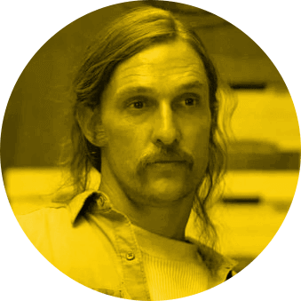
Matthew McConaughey, probably
It was at this point we took a step back.
The client also shared our concerns with the crowded UI, and
there was now a demand from the production company to try and
get as many custom bookings from users, rather than a lot of
pre-generated ones we’d populate the site with.
We had a rethink about the entire mixing deck, and quickly, and
crudely, sketched a possible solution which stripped back the
UI to it’s essential parts.


In this revised flow, after selecting a
celebrity the user was presented with an area to write their
idea, if they got stuck or needed inspiration they could hit a
‘Give me an idea’ button beneath, this generated a random
activity which could be rewritten or built on. Hitting done
took them to a kind of confirmation screen which brought back
the more visual approach of earlier wireframes - overlaying the
booking over a photo of the celebrity.
From this screen hitting ‘Book This’ took them to the next step
in the flow - a chance to say why exactly they wanted to do
their booking. We kept in options for editing the activity,
this took the user back a screen, and a button to change the
celebrity which opened in a dropdown to allow them to quickly
switch between celebs and try different combinations without
jumping back two steps.
The production company were keen to receive as many custom bookings as possible. The hope was from these they’d been some stand out suggestions which would make great TV. To try and encourage this I introduced a screen in between the first screen where the booking was created, and the confirmation screen. This was an overlay which would appear if the user had just selected a pre-existing idea, trying to nudge them to go back and be more creative.
It was a hard balance to strike - trying to
encourage users to be more creative, but not put them off using
an existing idea. We tried a number of different options for
copy to get the right tone but ultimately we dropped this
screen, it felt like an unnecessary barrier to entry, and was
quickly flagged during informal user testing in the office -
both at Mint and on the client side - as something which didn’t
sit right.
Nonetheless, we were at a good point with the prototype. The
client was happy with where we had landed, and we felt that the
reduced solution we’d arrived at was simple and quick to use,
and hopefully a little more fun as a result.
At this point I moved on to looking at desktop wireframes -
translating the booking experience for larger screens, and
starting to consider the many auxiliary pages which made up the
site. These included:
I produced around 5 iterations of desktop
wireframes. Prototyping elements of the more interactive
elements in Axure where necessary. Of course, a lot of
fine tuning would happen in the browser, and learnings from the
skeletal, rough version of the site we had up and running were
informing my wireframing decisions here. I began to work more
closely with our front-end developer at this point, though
visual design would still have to wait.
The booking generator scaled up nicely, with few tweaks needing
to be made. One concern was image quality, as on desktop these
would appear full-width, so at an early stage we made it clear
that we’d need to be provided with decent, high quality images
and began to trial these.


I approached the pages in a modular way,
using a one-third / two-thirds layout for many of them which
stacked well on mobile. Around this time we also began to build
out a loose style guide in the browser featuring a library of
what were beginning to become the common elements across the
site.
As design and build advanced, content was still a little behind
- something we were going to be provided. Often your designs
won’t appear in the ‘ideal’ state you have in mind, so I had to
ensure pages and modules would adapt to large and small amounts
of copy and that the design could degrade gracefully.


There are two points in the flow at which a
push for donations is made. Firstly inbetween you creating your
booking and entering your details, and secondly at the end of
the flow, once your booking is complete.
Mid-flow the donations screen included details on how you could
text to donate, an image, and a brief amount of copy. We were
careful not to overload the user with information at this
point, or snd them off to another destination when they were
most interested in completing their booking. However, at the
end of the booking process a full donate form is introduced,
along with further copy, and all the celebrities, looping the
user back into the creation flow if they want to make another
booking.


I often find a homepage is best to end with
rather than start with, it can be tempting to launch intp
homepage design before anything else, but it's a bit like
designing the cover before you've got a book to wrap it
around.
The homepage needed to satisfy many requirements:
The solution was again to take a very modular approach so
blocks of content could be added and removed easily from the
page without the design falling apart. This was especially
important when considering the post-transmission state which
would be a lot sparser.

Visual design was pushed back to late in
the project as we were waiting on visuals from Channel 4 - the
show logo, and set designs, which would feed into the look and
feel of the site. We were eventually given a logo which had a
glitzy, Hollywood, red carpet feel.
Up until this point my wireframes were flat, and image led, but
now I could begin to elevate this slightly, though I was keen
to craft a style which complimented the over-the-topness of the
logo, rather than one which mimicked it.
As we received the logo late, just under
two weeks were available for visual design. I designed several
key pages, but otherwise paired closely with our front end
developer to apply the style guide and design and tweak
indivdual elements where needed.
The look and feel remained predominately flat with bold
typography and one strong colour. Yellow can be tricky to work
with but using an online colour checker I ensured all text was
legiible and passed Channel 4's accessibility guidelines.
Certain areas, such as the header, where embellished with stars
to mesh with the logo a little more closely, though I was keen
to limit the extent to which this was used, concious the pages
size was already a little bloated due to the number of
photos.


Once the style was established and implemented I had a little time to add some love to a few areas of the site. I created a number of small illustrations and icons as well as finessing empty and error states. Visual tweaks were also so made in the browser, for example, refining type size, and the darkness of images with text on until the balance was just right.
In under three months we had a fully
responsive site ready to launch. It was compliant to Channel
4's accessiblity and browser support guidelines, and in the
time it was live it collected over 20,000 bookings.
Here is a partial demo of the live, final site.
Overall I was very happy with the finished
product. Bookings were quick and easy to make and the process
felt smooth and fun. A big shout out to Mint's tech team for
keeping things lightweight and speedy.
In hindsight, perhaps we could have been more consistent and
in-depth with our user testing. Once the project was underway
most user testing was done informally and quickly in the
office. Of course, part of the challenge was satisying all
parties in charge of the show, managing their expectations, and
delivering on time. As the website had a short lifespan we
didn't have the time to gather in-depth learnings from our user
base and apply these findings to the site in the way we can
with our own products.
That said, I think the result was highly usable and the
investment in time spent prototyping on mobile, afforded by
great tools such as Flinto and Invision, more than paid
off.
This project also taught me a lot about working in a modular,
style guide kinda of way, rather than thinking on a
page-by-page basis, something i've come to love and have since
refined on more recent projects.
Noam Sohachevsky,
Director, Mint Digital